Recipe Detail Page
Research & Interface design-
Redesign of arguably one of America’s Test Kitchen’s most important pages: The Recipe Detail Page.
-
The goal of this redesign was to enhance the user experience by addressing common pain points and providing solutions that improve navigation and accessibility.
-
Made ingredients and instructions easier to view on tablets by displaying them side by side, allowing users to scan information quickly without unnecessary scrolling.
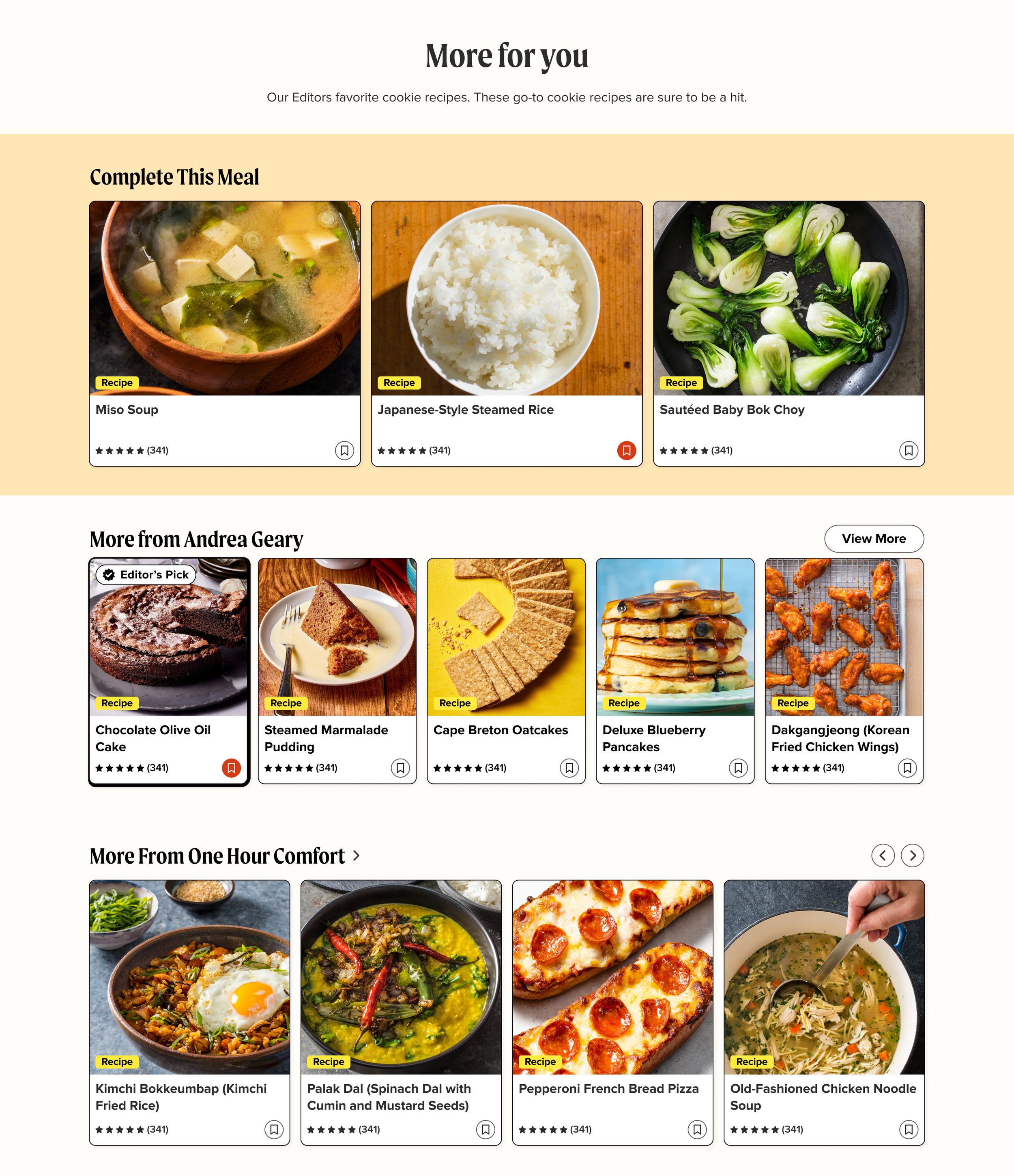
Streamlined the meal planning process by offering additional recipe suggestions curated by the editors.
Provided a seamless way for users to explore related content and discover new recipes.
Restructured recipe layouts, added bolded ingredient measurements, and incorporated interactive elements like pressed states to improve usability.
Collected user feedback and conducted testing, which confirmed that these changes led to a more intuitive and enjoyable cooking experience.
Helped users complete their meals with ease by simplifying navigation and providing clearer information.
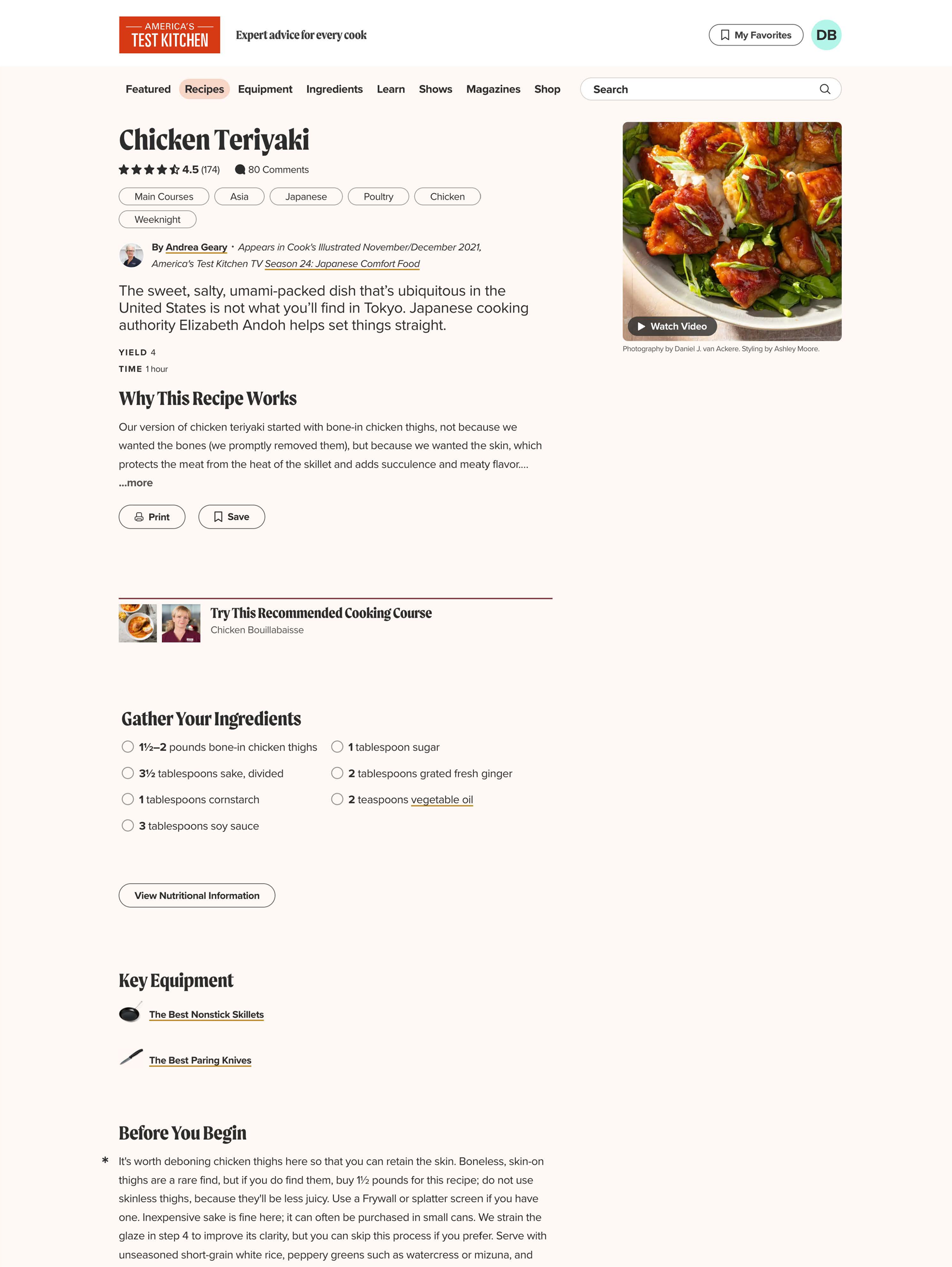
before
After
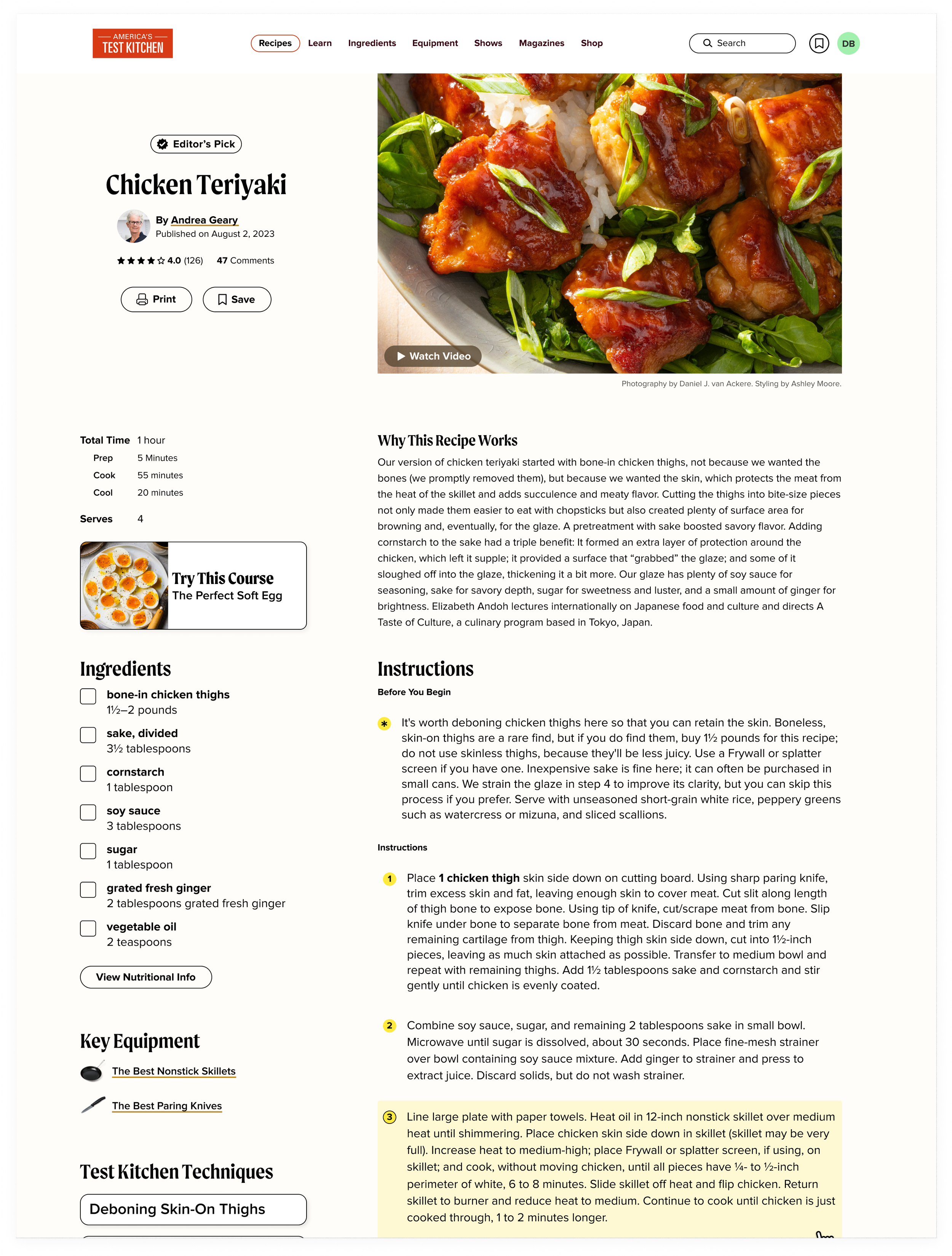
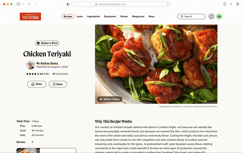
Above The fold redesign
The image is now larger, highlighting the food's textures and beauty.
The title is cleaner and more visually digestible, with the dek removed.
Tagging has been moved to the bottom for a more streamlined look.
A new "Why This Recipe Works" section provides a sneak peek into key recipe elements.
A total time breakdown is included for better clarity.
The Editor’s Pick callout is now prominently displayed.
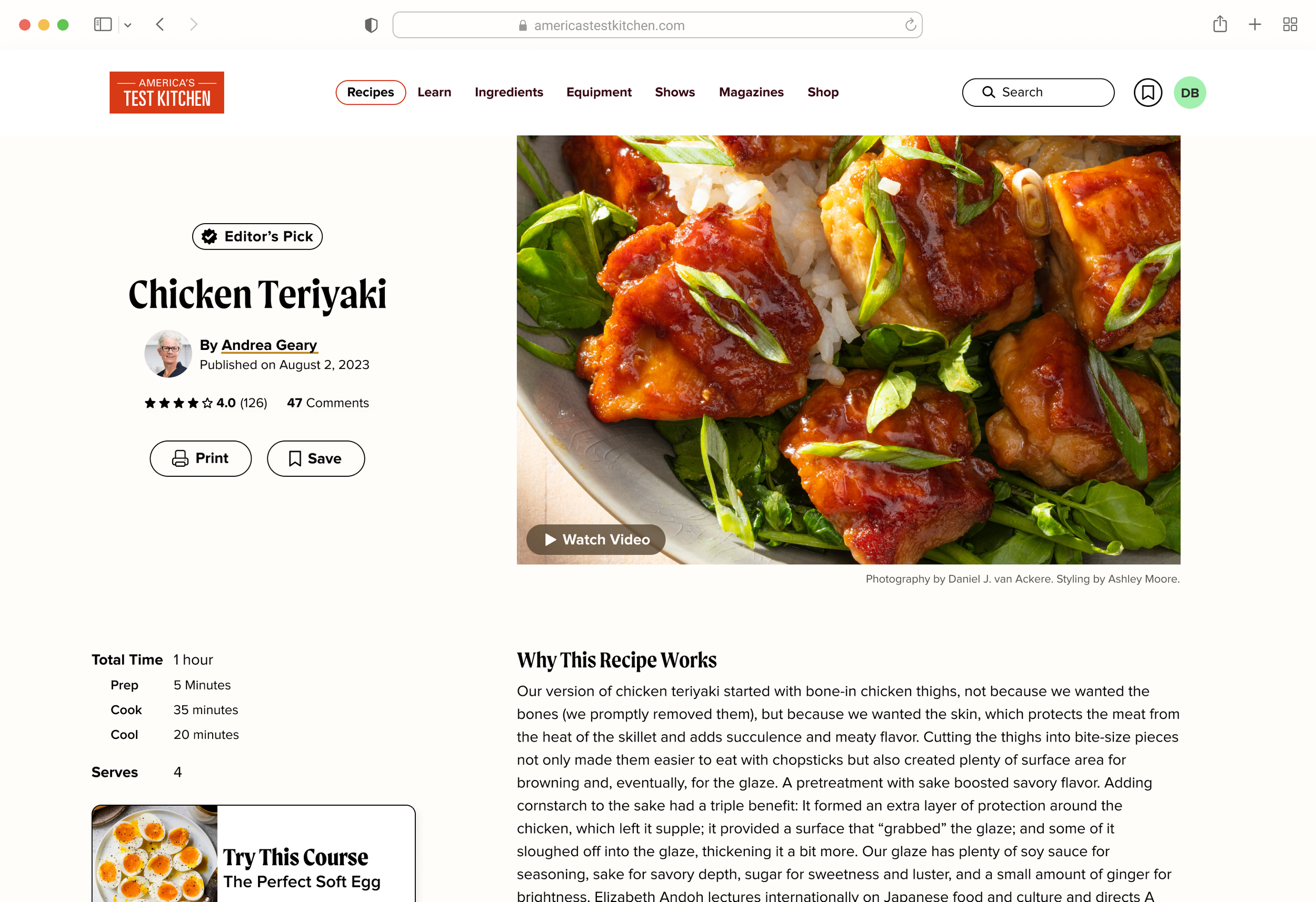
Instructions
Addressed user complaints about cooking live from a tablet
Ingredients and instructions are now side by side—no more scrolling on tablets with dirty fingers. Everything is visible at once.
Key Equipment and Techniques are now ranked below ingredients for better clarity.
Ingredients are now designed with the ingredient and amount separated, making them easier to scan quickly.
Total measurements of ingredients are now featured and bolded in the instructions, helping users with small kitchens who don’t have space for mise en place.
Pressed states are now included in the instructions, allowing users to mark the step they’re currently on.
Tags have been moved to the bottom of the page, as they felt like tertiary information for users making quick, game-time decisions.
User testing confirmed that these changes significantly improved the user experience, with many positive comments expressing gratitude.
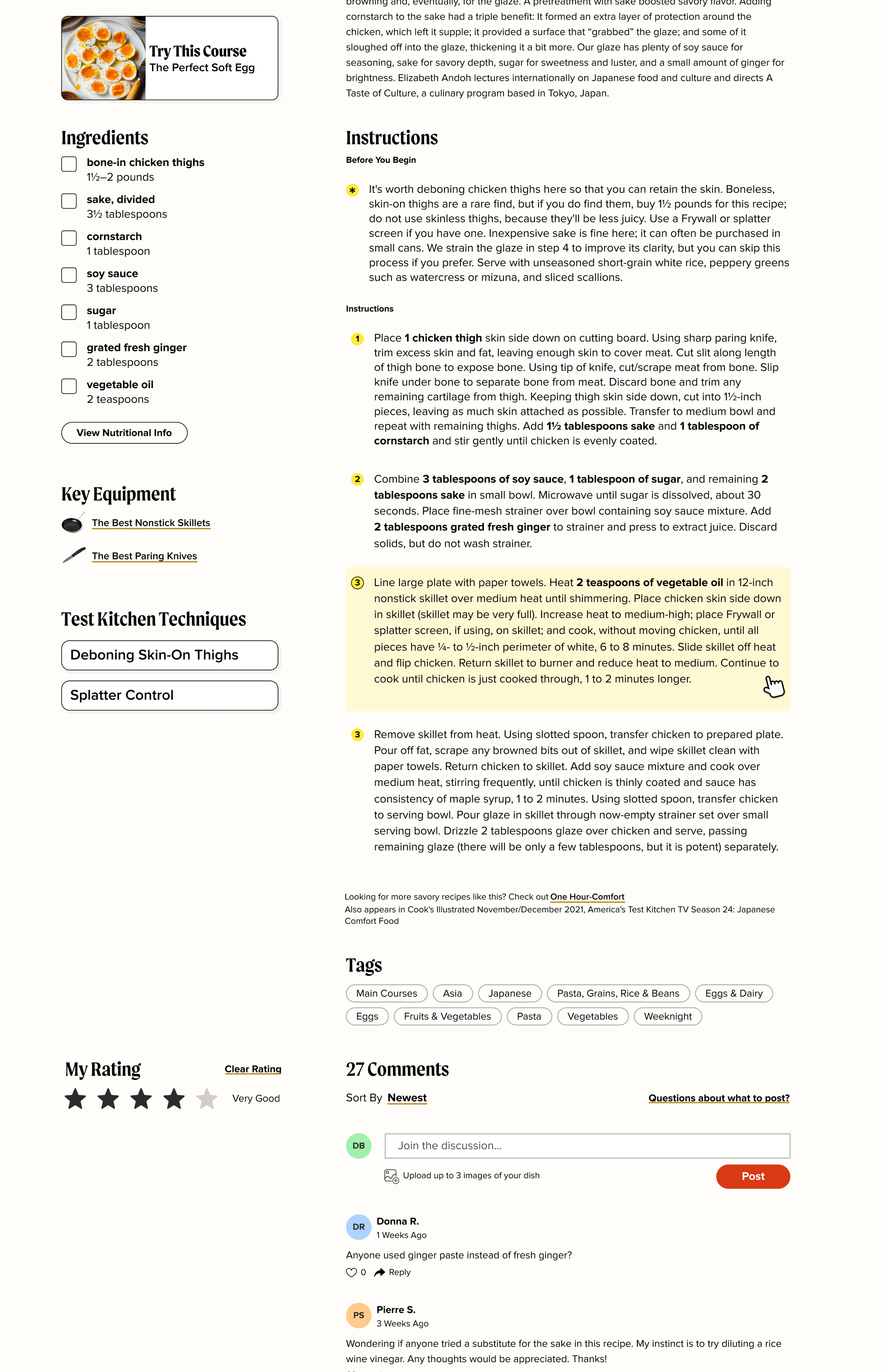
After the Recipe
Users expressed a desire for more than just one recipe when making dinner—they need to complete the meal. They were also looking for recipes that were relevant to the current recipe in more ways than one.
Complete This Meal: helps users complete the meal, featuring other recipes selected by the editors that pair perfectly.
More From The Test Cook: users are now guided to a filtered collection of all meals and articles the test cook has made.
More From This Cookbook: included a collection of other recipes from the featured book, as users are more likely to explore similar genre-based recipes, such as One Hour Comfort or A Very Chinese Cookbook.
Designed at America's Test Kitchen as a self directed side project. UX design by Myself. Research pulled from previous work by Kate Tetreault. Inspired by former product manager Jenny mackintosh.