
Homepage & Discovery Experience
Research, Strategy, Information Architecture & Interface DesignLead Product Designer for the redesign of America’s Test Kitchen Homepage on Desktop, Mobile, and App
Homepage redesign generated 1,400 incremental net starts over 6 months and approximately $250K incremental revenue.
2025-2026
-
America's Test Kitchen's homepage was not effectively helping members discover content. Nearly half of homepage visitors left without engaging with a recipe, review, class, or article.
As the lead designer on the Search & Discovery team, I partnered with Product, Engineering, Research, and Content teams to reimagine the homepage as a destination for exploration rather than a simple content gateway. The work expanded beyond the homepage itself and included updates to site navigation, information architecture, and content discovery patterns across the platform.
-
Improve Content Discovery:
Help members and prospective subscribers find relevant recipes, reviews, classes, and editorial content more efficiently.Reduce Reliance on Search:
Research showed many users relied on search as their primary method of navigation. We aimed to create clearer browsing pathways and improve content wayfinding throughout the site.Simplify Navigation:
Address confusion surrounding existing navigation systems by redesigning the global header and footer, clarifying content categories, and creating more intuitive paths to key destinations.Validate Design Decisions Through Research:
Establish a stronger research practice by conducting moderated interviews, unmoderated testing, tree testing, and iterative prototype validation throughout the project lifecycle.Support Personalization Efforts:
Create a flexible homepage framework capable of surfacing relevant content based on user interests, behaviors, and seasonal trends. -
Partnered with Head of UX as well as my Product Manager on discovery and research efforts to better understand how members navigate and find content across the America's Test Kitchen ecosystem.
Conducted moderated user interviews, facilitated stakeholder workshops, and partnered with Head of UX and Project Manager on unmoderated usability and tree testing studies to identify navigation and discovery pain points.
Synthesized research findings (via Dovetail AI) into actionable recommendations that informed a comprehensive redesign of the homepage, global navigation, and content organization strategy.
Redesigned the homepage to surface a broader variety of content above the fold, helping users discover recipes, reviews, classes, and editorial content without relying exclusively on search.
Developed and tested new information architecture models, navigation structures, and content hierarchies to improve wayfinding and reduce user confusion.Collaborated closely with Product and Engineering to prototype, validate, and iterate on solutions that balanced user needs with business goals.
Product Manager’s data found that the redesign generated approximately 1,400 incremental subscription starts and contributed roughly $250,000 in projected annual revenue, while establishing a scalable foundation for future personalization initiatives.
Before
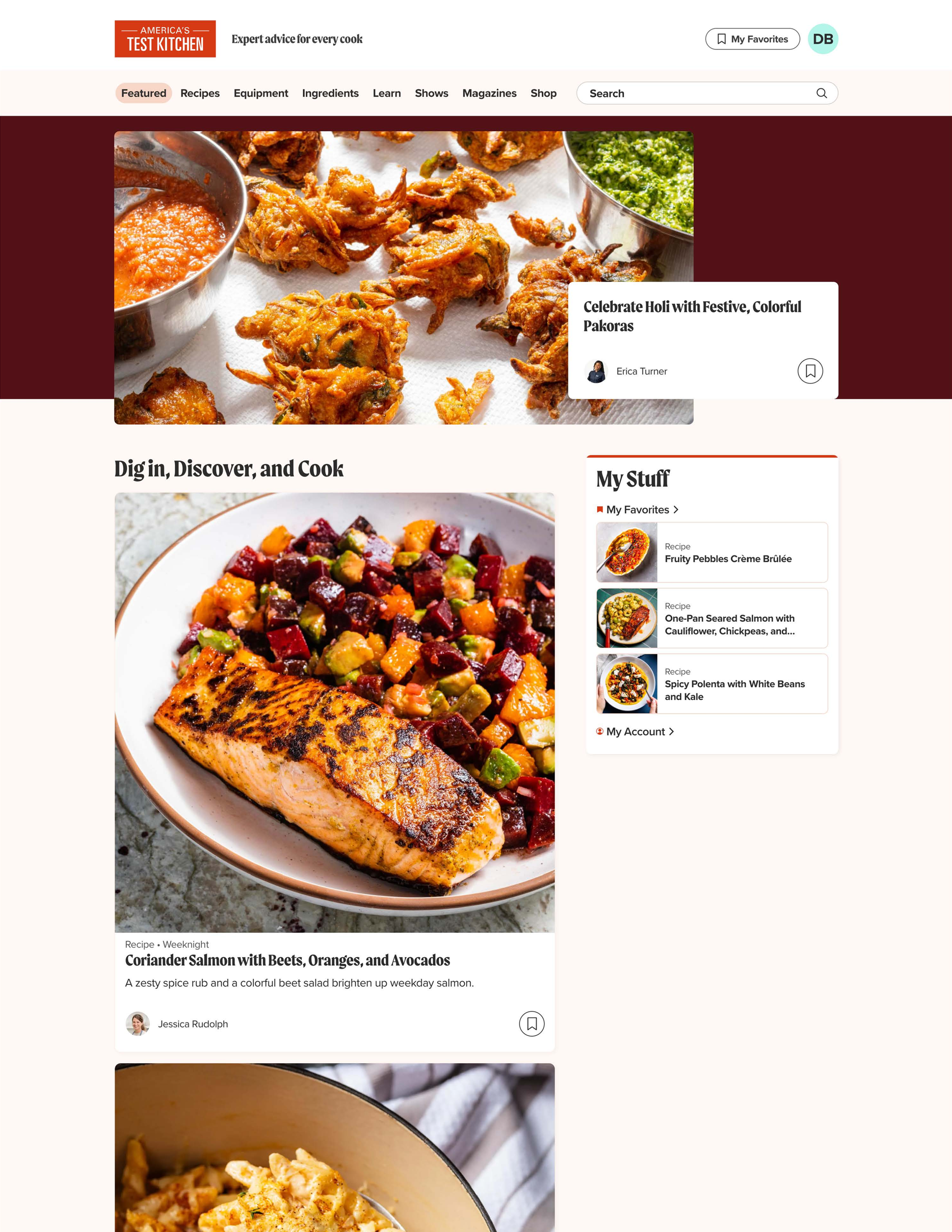
Issues with old design
The homepage was originally designed to be a high-visual, endless scroll of inspiration (think Pinterest, Instagram, TikTok).
A neat idea in theory, but we were running into a few issues:
We were looking at the data and it showed that no one stayed on the homepage for very long
Many of our images and components were in a square format, so when users viewed our website on anything other than mobile, they images would get so large
Before
Issues with old design
Customer research led to to see some of the reasons why the bounce rate was so high
All recipes and articles were based on recency of post or repost date
Customers wanted to find recipes that were relevant to them, not whatever is new to the site
Some customers enjoyed the inspiration aspect of the homepage, but felt like customization would be important
Customers found the images and all components to be too big (mobile included)
They weren’t sure why this what the home page, felt that it could be “more”
A lot of the time, text in cards would cut off (see Evolving the Peek Card in the Mise Design System where I tackled this separately)
2025
Initial Redesign
2026
Refinement
Phase 1: Competitor research, early design explorations, and the first iteration of the homepage experience. Document the decisions and outcomes you can substantiate from this phase.
Phase 2: Revisited the experience, building on the earlier work and exploring further improvements. Clearly label the mockups and design explorations that were still in progress when your role ended in May. (maybe in tags) Talk about how this was the year we were able to invest in more research and discovery, prototype testing with super users and prospective members
Designed at America's Test Kitchen alongside the art direction of Kate Tetreault. Product Managed by Erin Ozmat and Becca Eastwood.