Cookbook Collection
Research & Interface design-
Design a captivating Cookbook Collection Detail Page that not only highlights the book’s recipes but also serves as an immersive extension of the book.
-
Seamlessly integrate calls to action to purchase the book, make the page feel more engaging by adding different types of information besides recipes, and create a solution that helps the user filter though the recipes.
-
I designed this page with these people in mind:
Users who are here just for the recipes
Potential customers who want to explore the book before they purchase
Fans of the book who want to follow the authors
Our Editorial team who maintains and updates these pages
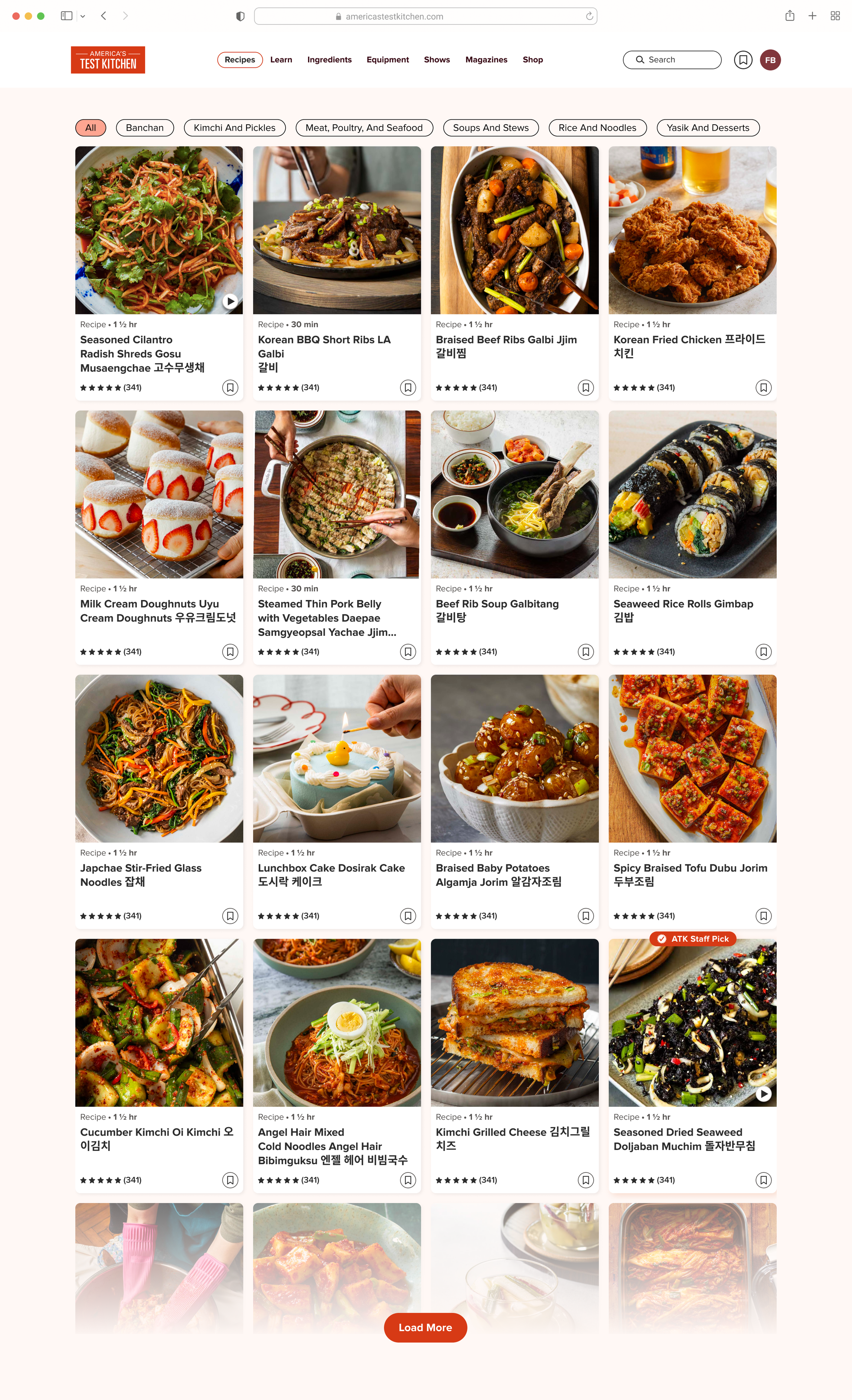
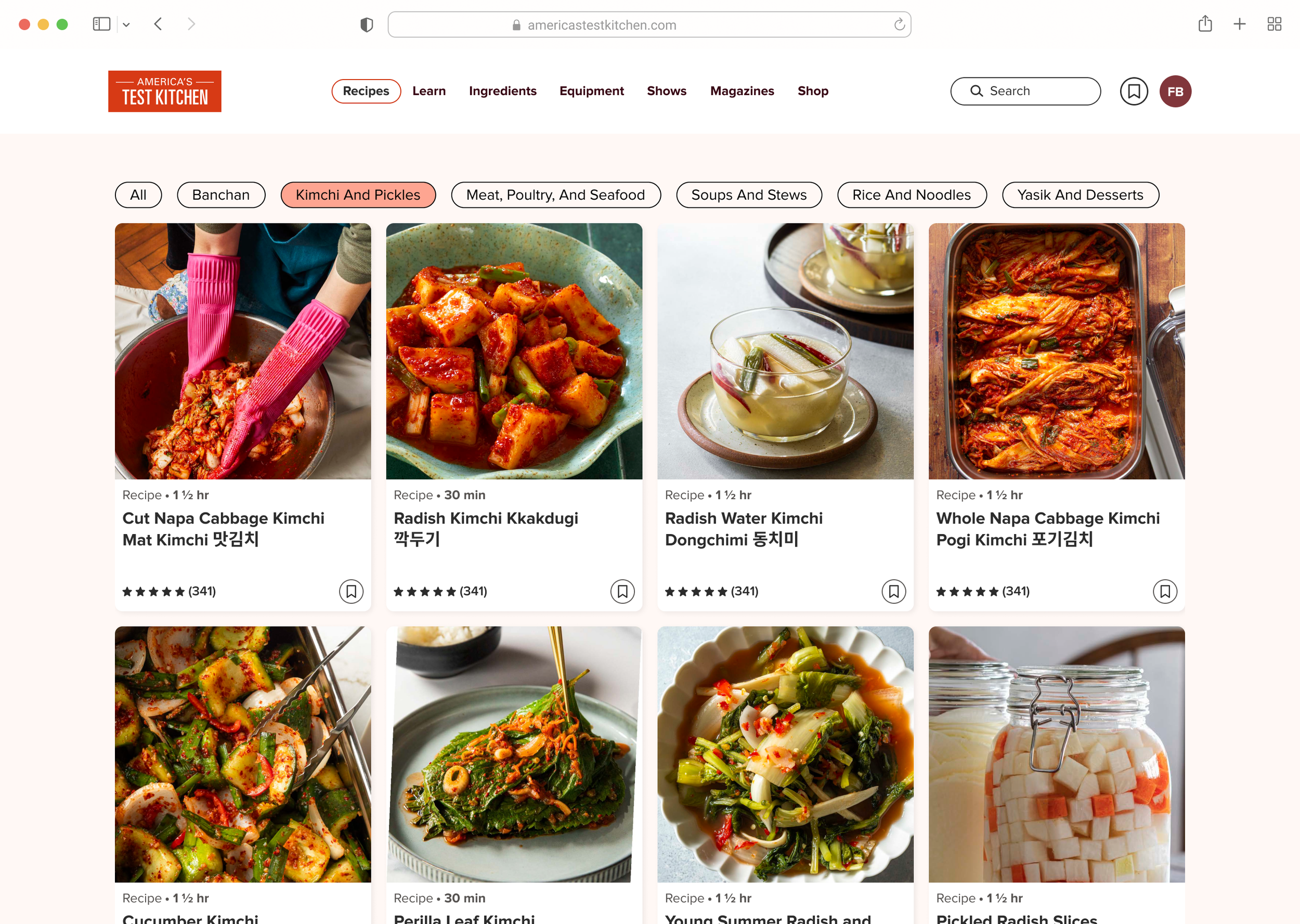
For the users who just wanted the recipes, I ensured the recipes were filtered by chapter. Many of our users refer to both their book and book sections in order to begin meal planning.
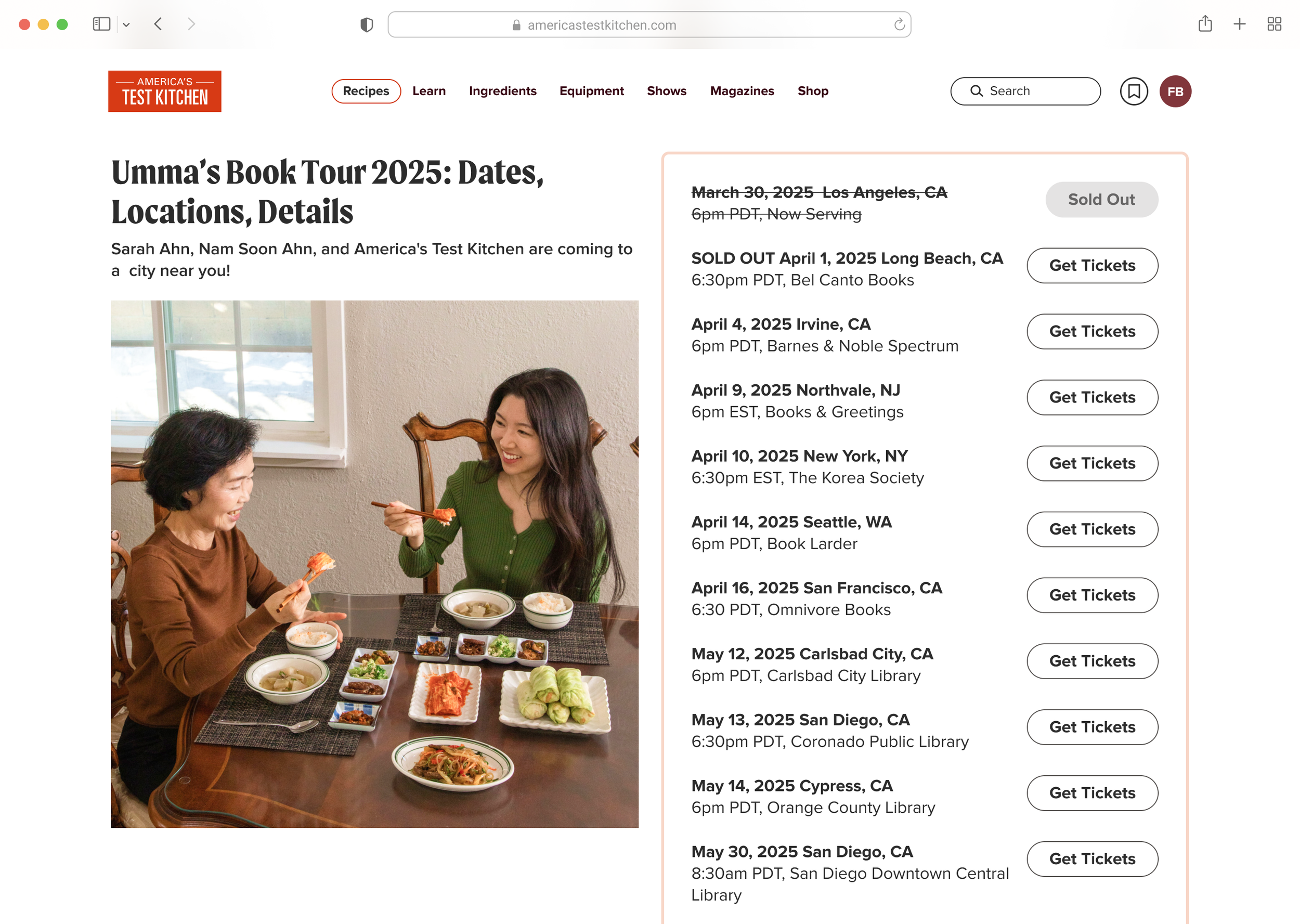
In order to appeal to users who want to explore the book before they purchase as well as fans of the book, I designed a page with engaging web articles, book tour dates, and more. Through this, the Cookbook Collection page grows into so much more than just a collection of recipes; it becomes a dynamic hub for culinary inspiration.
And finally, for our Editorial team: I wanted to make this page easy to add or remove sections that made sense for the specific book. For example: If there are no more book tours, the tour date component can be removed via our CMS.
before
After
Issues with the Old Design:
There was no clear option to purchase the book, making it difficult for users to access it directly from the platform.
Filters were inconsistent, with many recipes being double-tagged (e.g., vegetable and vegetarian), leading to improper filtering and difficulty narrowing down results.
Some books contained over 400 recipes, forcing users to scroll endlessly to discover all available options, creating a frustrating and time-consuming experience.
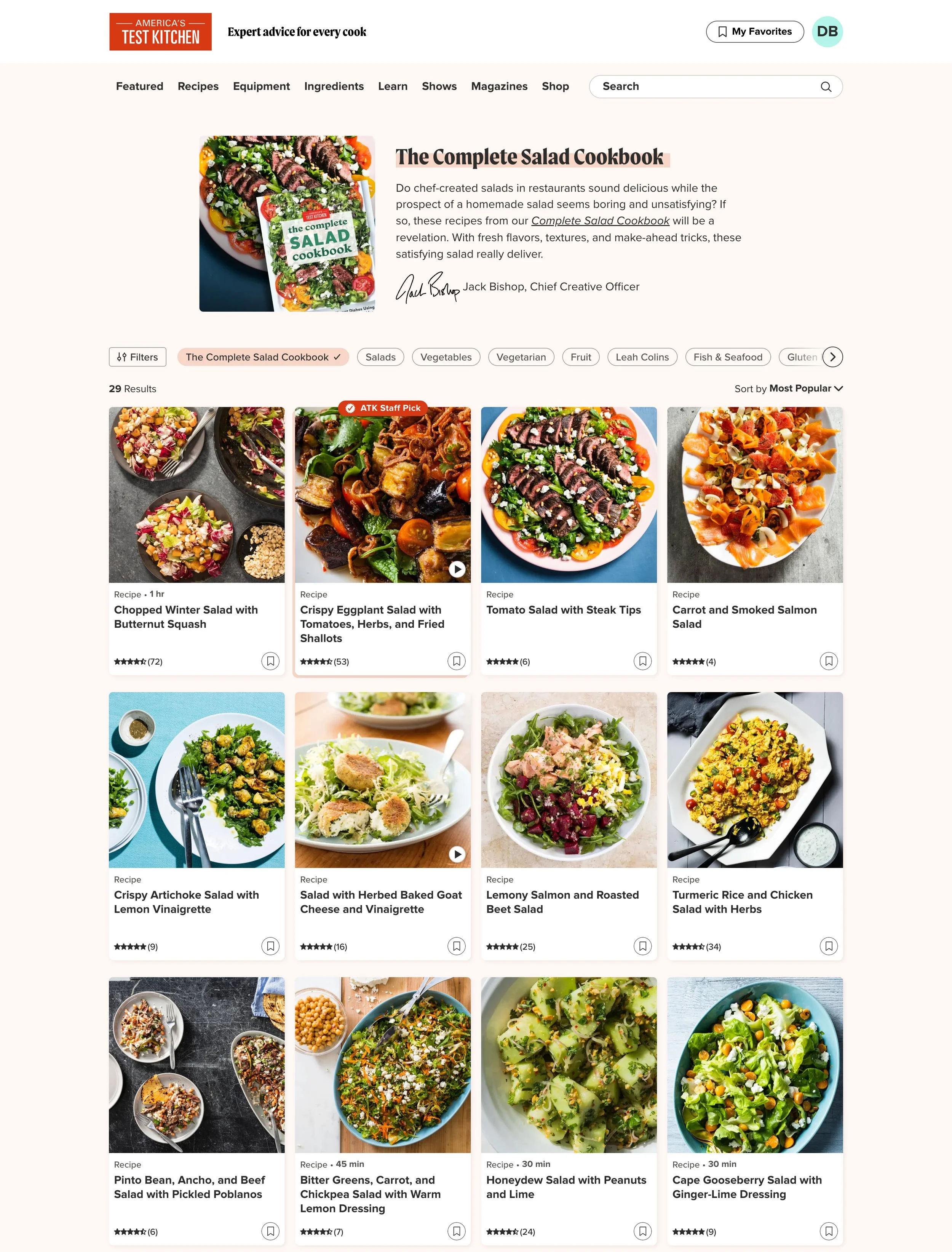
Solutions in the New Design:
The new design incorporates visual elements that create a more compelling, storytelling feel, enhancing user engagement.
A clear callout has been added to allow users to easily purchase the book, with a direct link to our web shop for convenience.
The new design includes options for a "day one" page release (with a limited number of recipes) and a complete release, along with chaptered filters to make navigation easier and help users find recipes more efficiently.
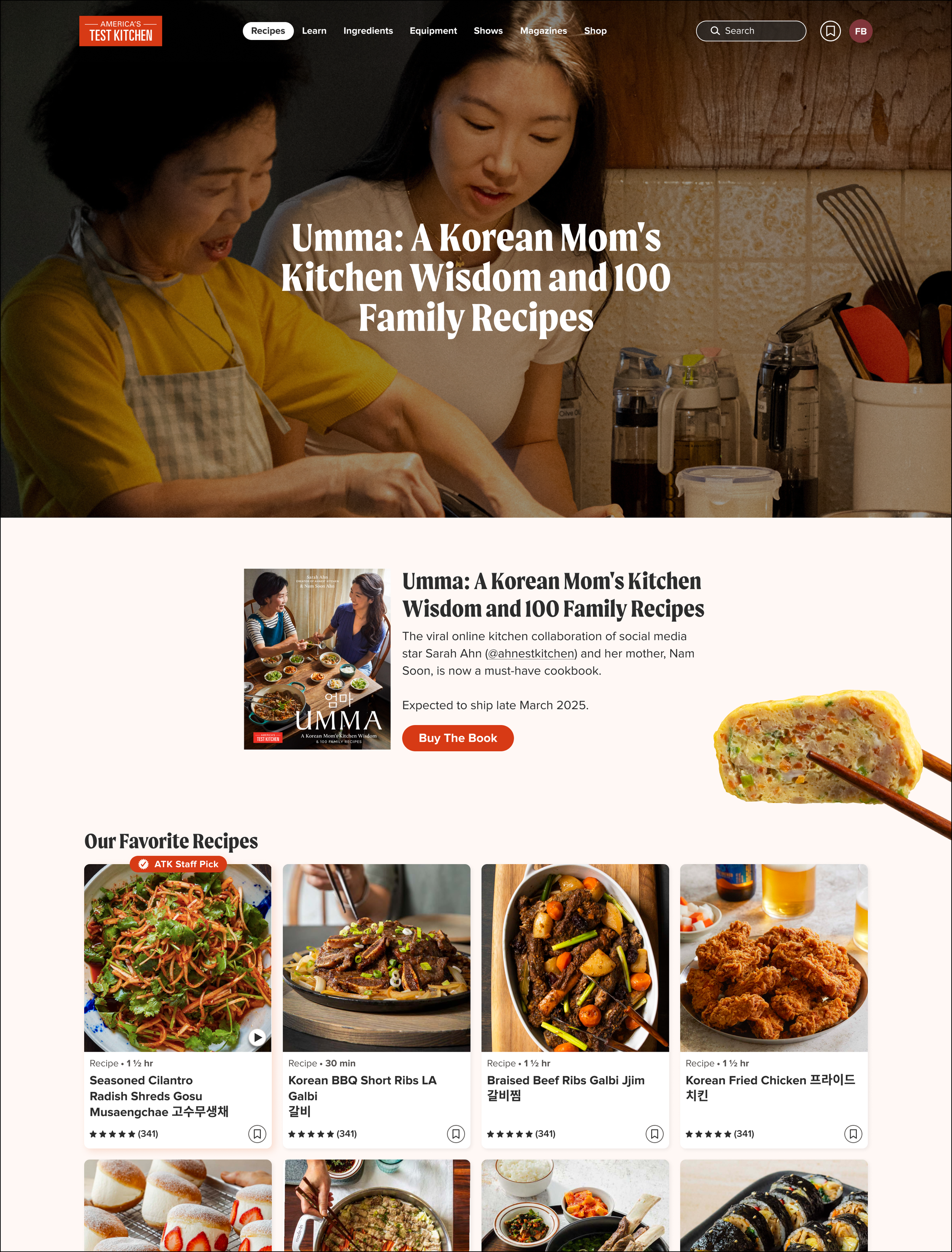
New Design Components
"Buy the Book" Call-to-Action (CTA) Card
Two-Column Book Tour Layout
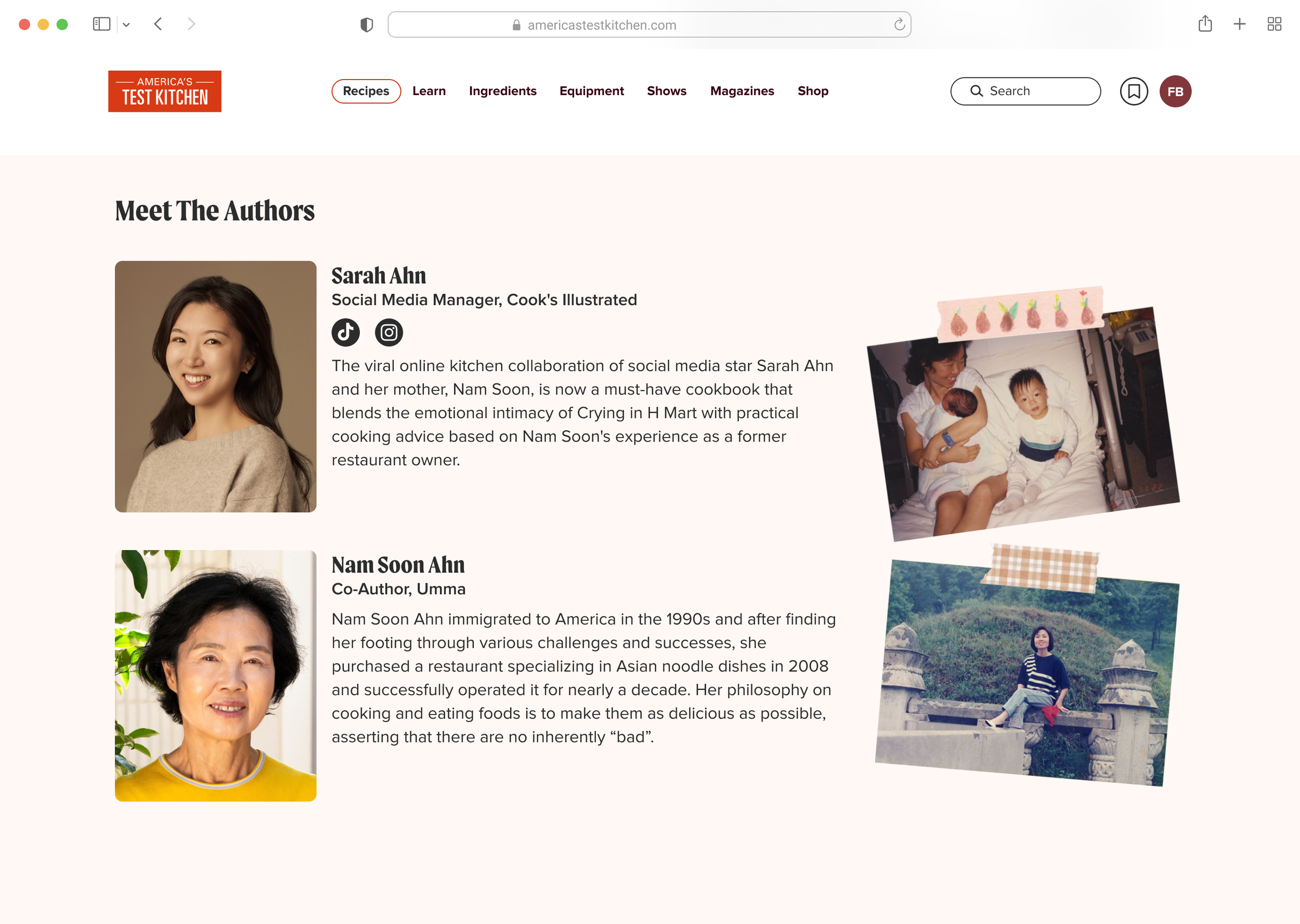
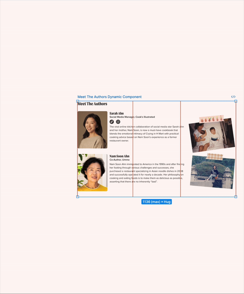
Meet the Authors Section
designed in figma to be dynamic
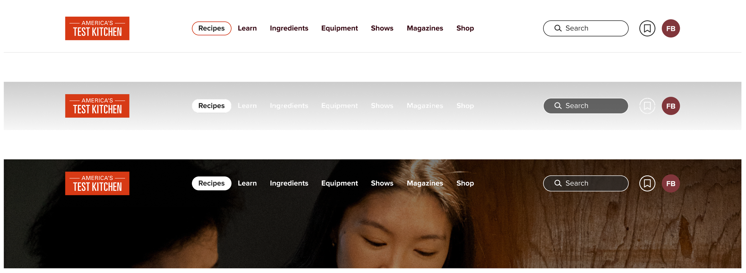
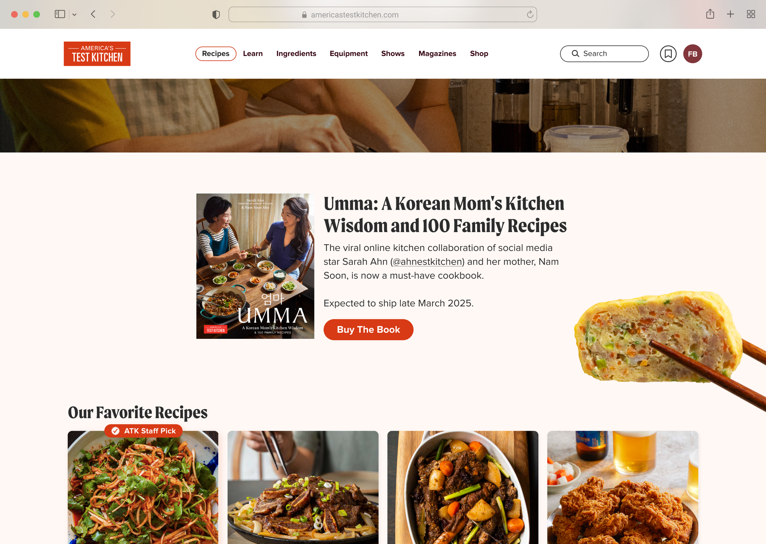
Additional edit: Top nav redesign
Key updates to the top navigation include:
Two Versions: One for full-bleed images (and future dark mode) and another with an opaque design for all other use cases.
Sticky Navigation: The nav now stays fixed at the top, ensuring ease of use as users scroll through longer pages.
Refined Search Bar: The search bar follows standard design practices, with the icon on the left and non-bold text when unselected.
Cohesive Layout: The logo has been resized to a more appropriate height, with the search bar, favorites, and user initials now aligned to maintain visual harmony.
Chaptered filters
Designed at America's Test Kitchen alongside the art direction of Kate Tetreault. Product Managed by Erin Ozmat.