ATK App Redesign
Research & Interface designLead Product Designer for the majority of the redesign and rebranding of America’s Test Kitchen App. Design liaison for internal and external marketing and promotion.
Years 2022-2024
-
America’s Test Kitchen has had an app for a few years, but with it’s lack of advertising, clunky interface, and lack of data parity with the website, it’s no wonder that the app was only rated 2.6 stars in the Apple App Store.
Our goal was to refresh the America’s Test Kitchen app to reflect the brand’s new website design while optimizing and tweaking aspects of the design to reflect native app functions.
-
In order to successfully refresh the app, we had the following goals:
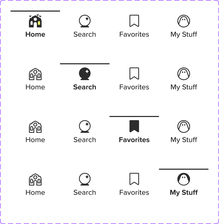
Navigation Redesign
We wanted to redesign the existing navigation within the app to make it simpler and more intuitive for users. This included simplifying the bottom navigation to four buttons (Home, Search, Favorites and My Stuff), and streamlining the top navigation to only contain the Menu button.Update Design
Major stylistic differences between the app and the website left the impression of an incosistent brand identity. We needed to update the app to follow new brand standards, which would help us maintain a cohesive brand image.Simplify Detail Pages
Subpages within the app also lacked a uniform identity; style varied wildly between pages, and some pages didn’t render properly within the app. To remedy this, we wanted to both perform a complete overhaul of many pages as well and introduce a simplified navigation flow.
Collectively, these objectives would improve user experience, increase user retention, and solidfy America’s Test Kicthen’s brand.
-
America’s Test Kitchen was founded and rooted in print media, so successfully updating the app required a fundamental shift in the way the work was planned and executed.
I delivered minor, incremental projects to the development team, rather than producing a major, singular design.
I embedded directly with the developers to ensure stable and intentional design changes were rolled out every week.
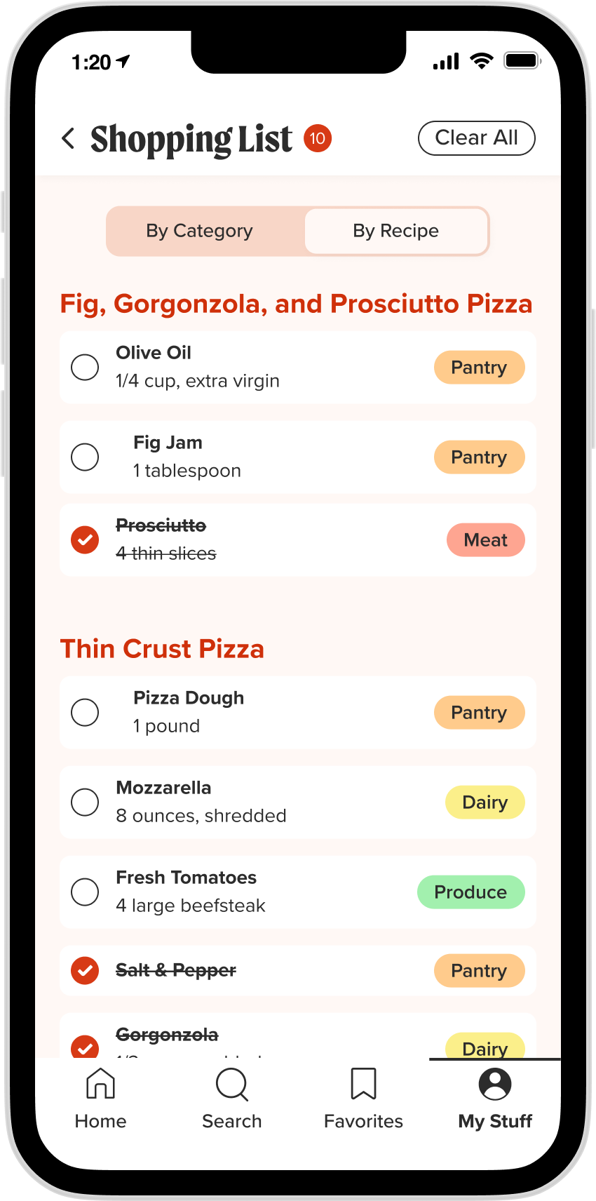
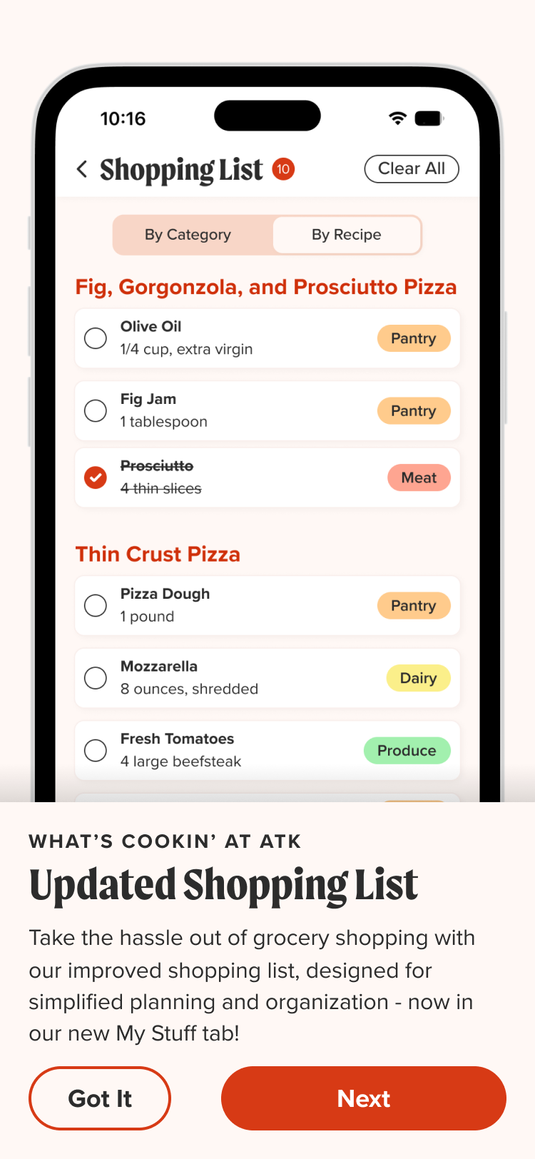
I designed app-native features, including Shopping List, Personal Notes, and "I Cooked This"
The app today is in a much better state: It’s currently rated 4.9 stars with over 12k ratings.
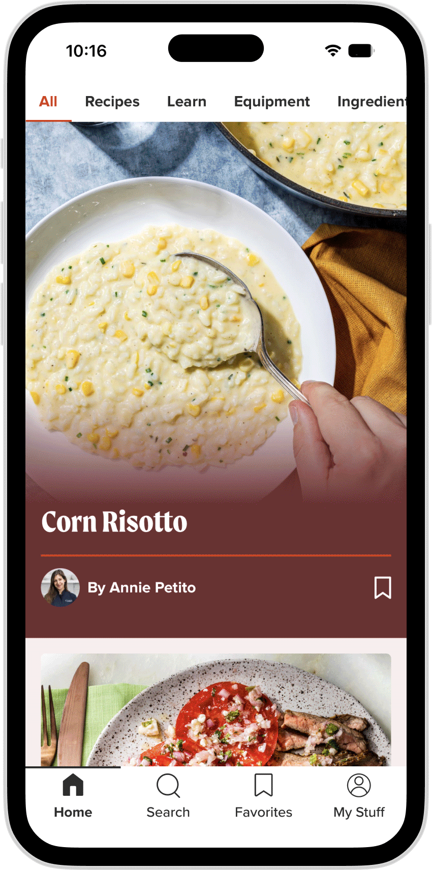
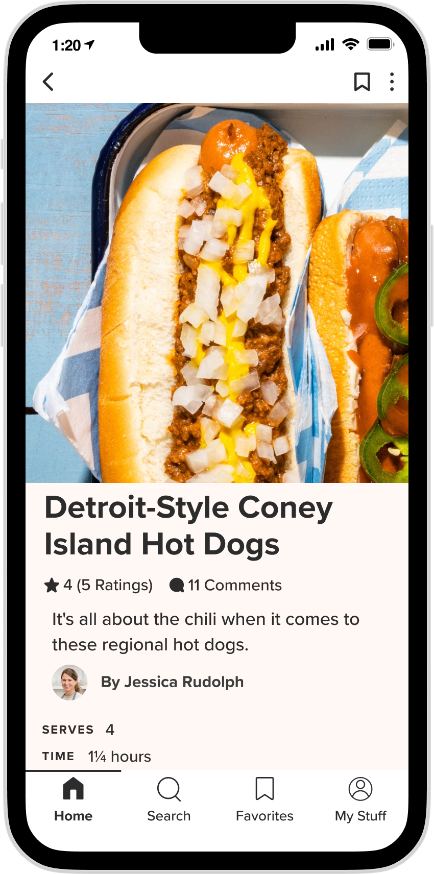
before
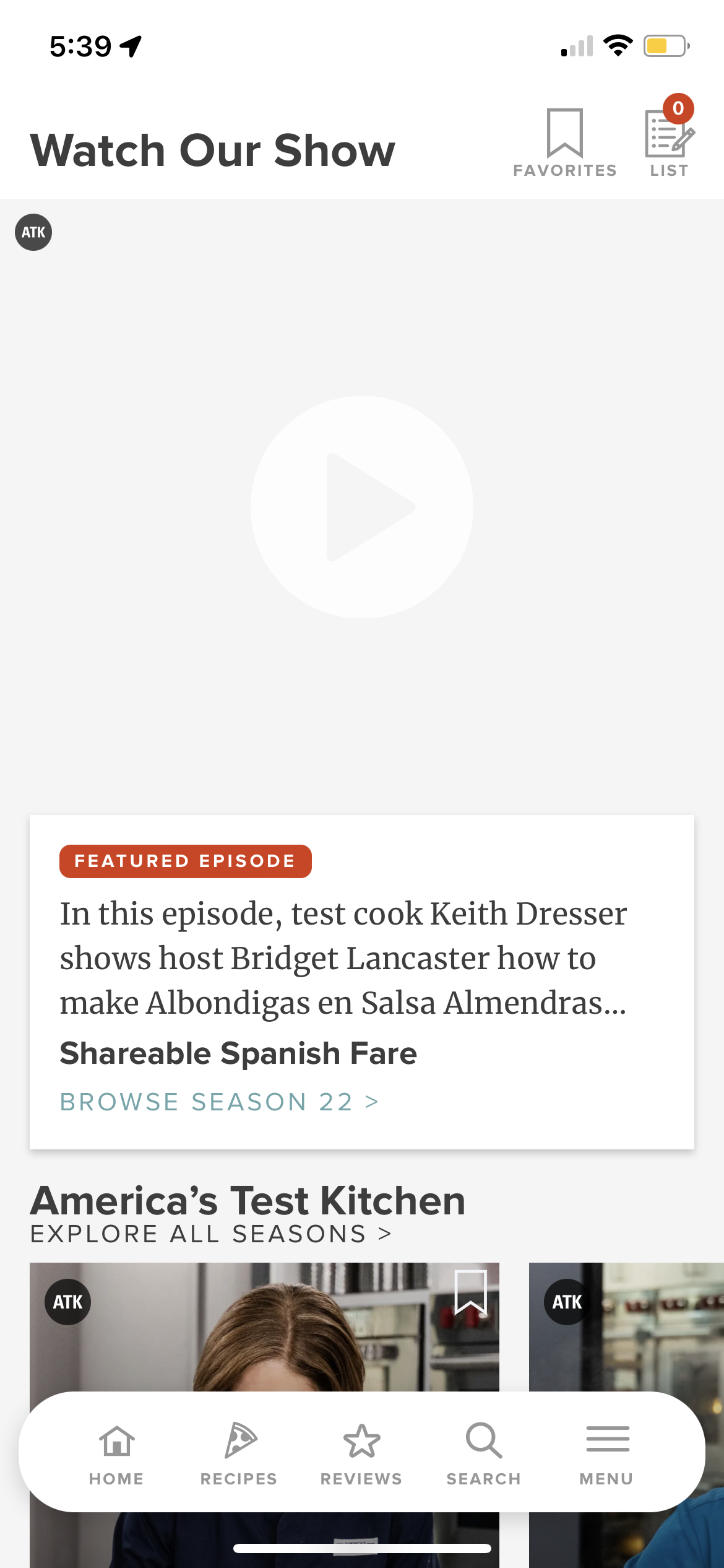
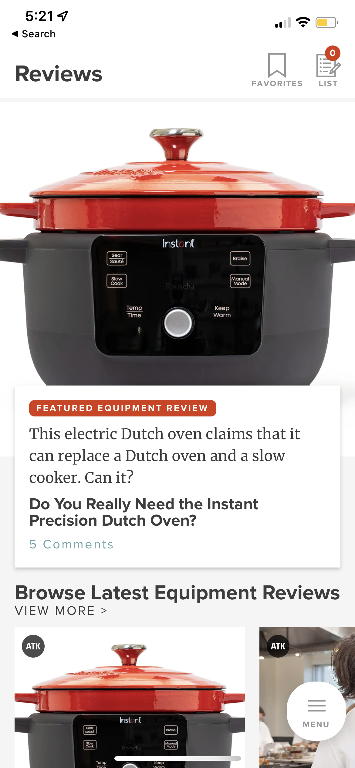
After


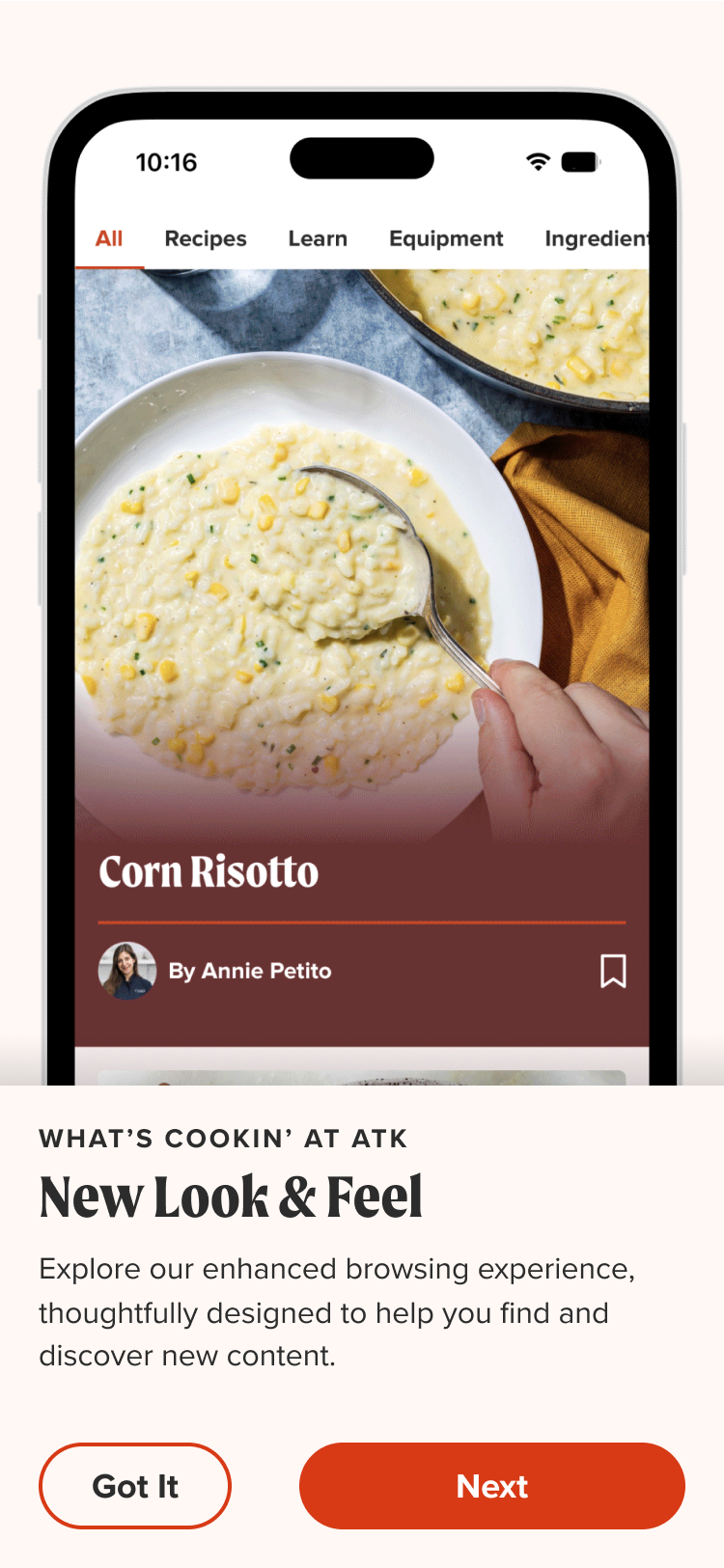
New feature Callouts describing updates to our app design
Example of a redesigned page
Here’s an example of a dev breakdown of a featured collection page designed with our branded components from “mise”

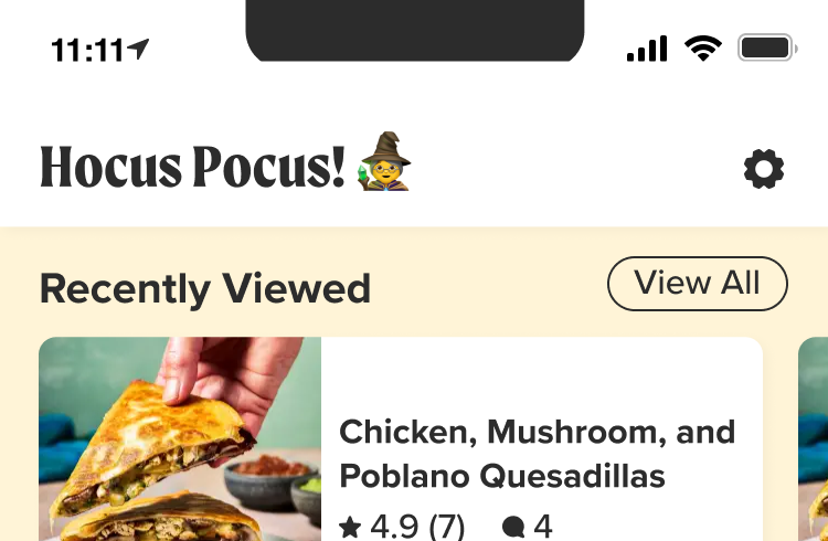
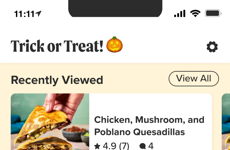
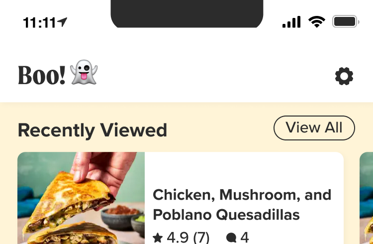
Halloween Mode
We wanted to try our hands at theming the app to see how we can roll our a dark mode in the future. Since we had time in October we figured it would be a fun way to try to incorporate Halloween while stress testing certain edge cases for visual accessibility. It was a fun way to delight our users while also helping the developers test the capabilities of working in React Native.
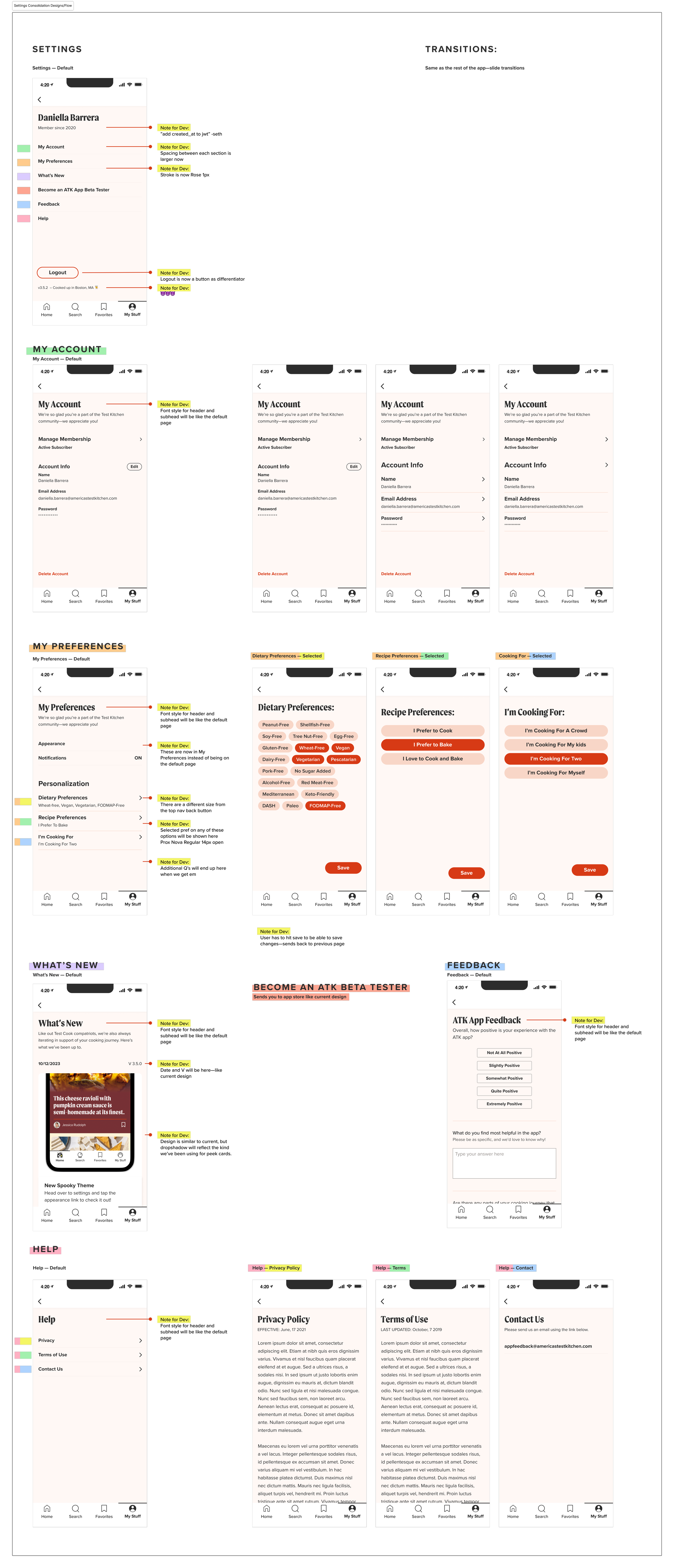
Example of a redesigned user flow
When transitioning to the new designs, we needed a more robust Settings page that guides users to key sections such as 'My Account,' 'My Preferences,' 'What’s New,' 'Beta Testing,' 'User Feedback,' and a 'Help' section.
Designed at America's Test Kitchen alongside the art direction of Tabitha Rodrigue & AbiHijeck. UX research & design by myself & Taylor Gonzales. development lead Seth Bridges. Product Manager Tristan Domville.