Essex Coffee Roasters
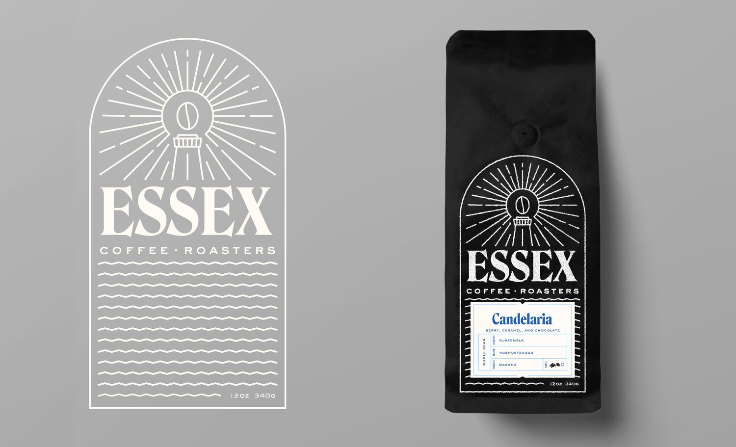
logo design & package designRebrand of a small batch, roasted to order, specialty coffee company. I wanted to call back to the visuals of their old branding—the lighthouse, but update it with a more modern touch—the coffee bean. Recalling my background as a barista I remembered when customers would complain that packaging is usually too hard to discern between roasts, and I took that into consideration when designing the labels. I created a system of colors that gave each roast their own color combination, but allowed more roasts to be designed. Although these labels differed from each other when set on a shelf, they also paired well with each other.


Art Direction by john magnifico 