Cook’s
Illustrated
logo refresh & cover design-
Update the iconic Cook’s Illustrated logo and cover to feel more polished and refined, while preserving its signature, recognizable style.
-
Magazine Cover Goals:
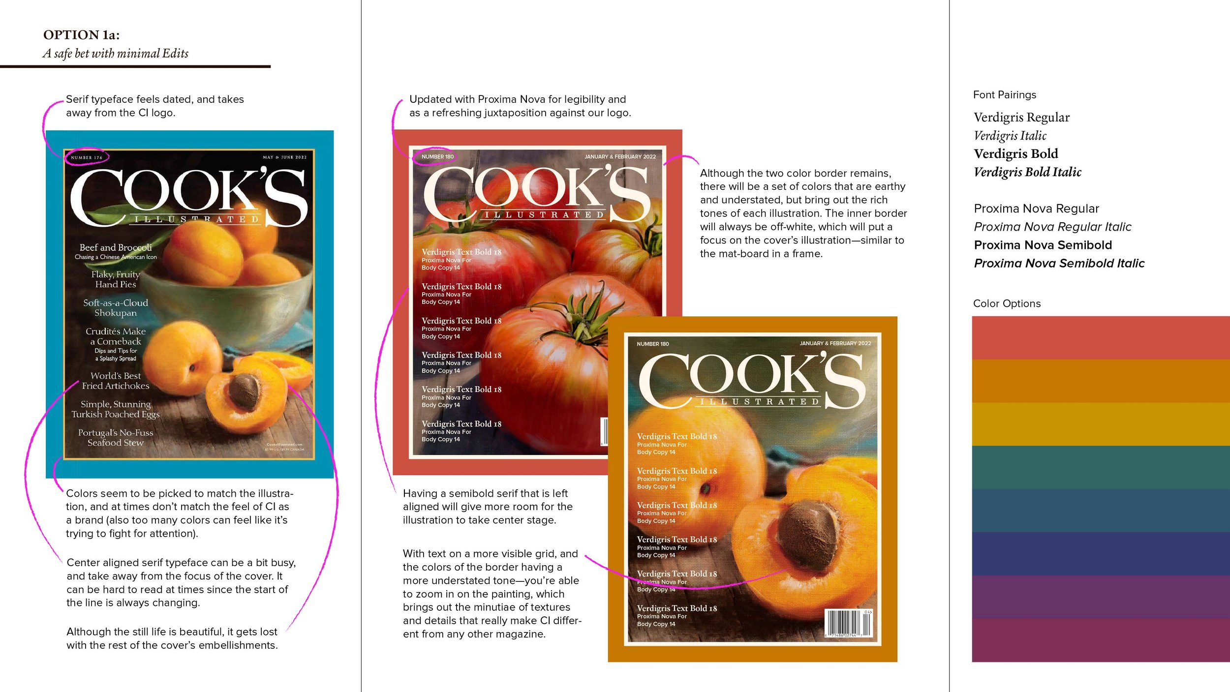
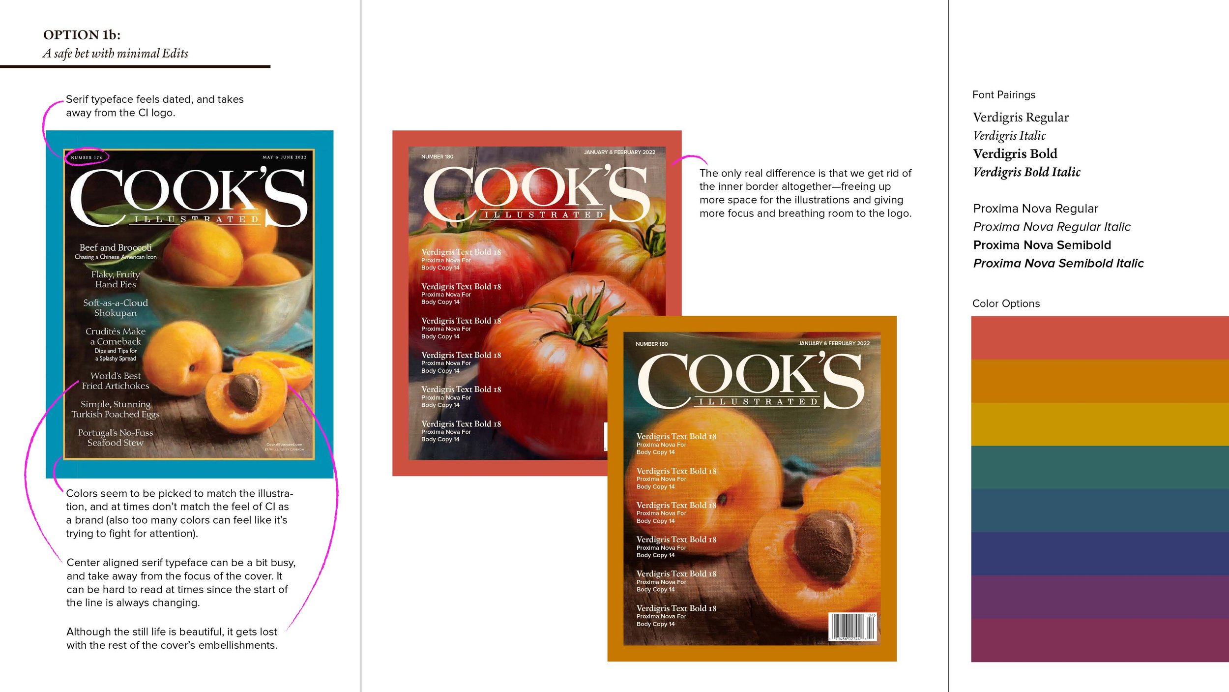
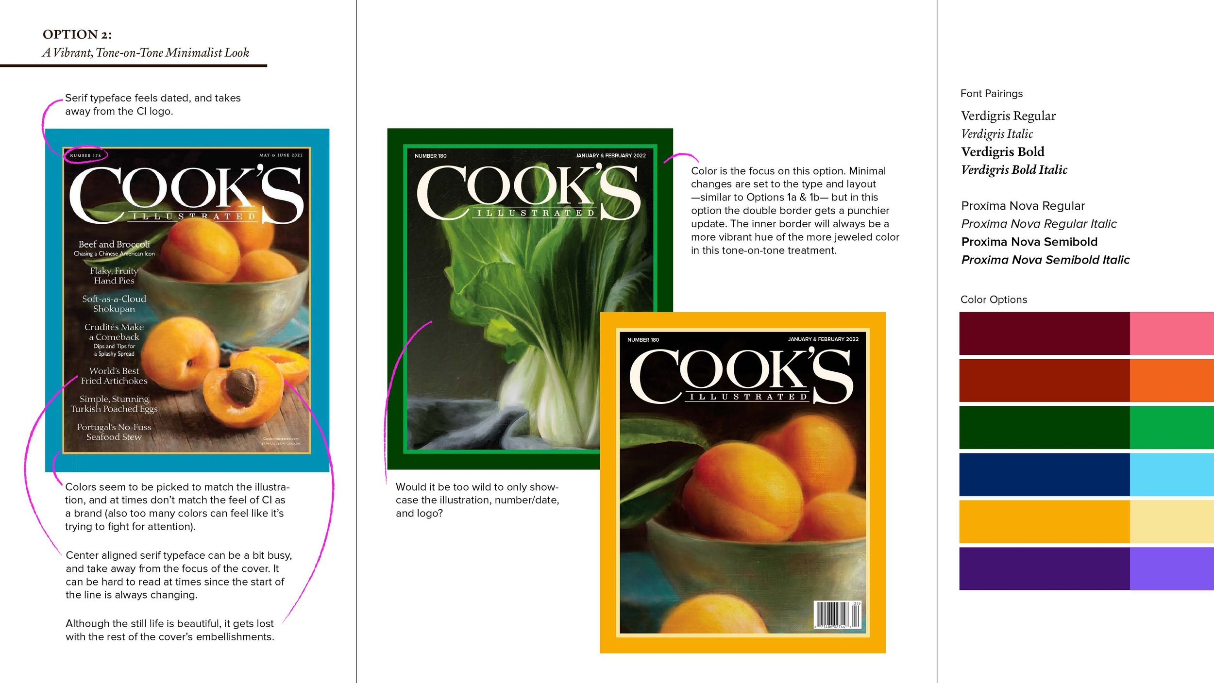
Add modern touches to the Cook’s Illustrated magazine cover while maintaining its iconic and recognizable aesthetic.
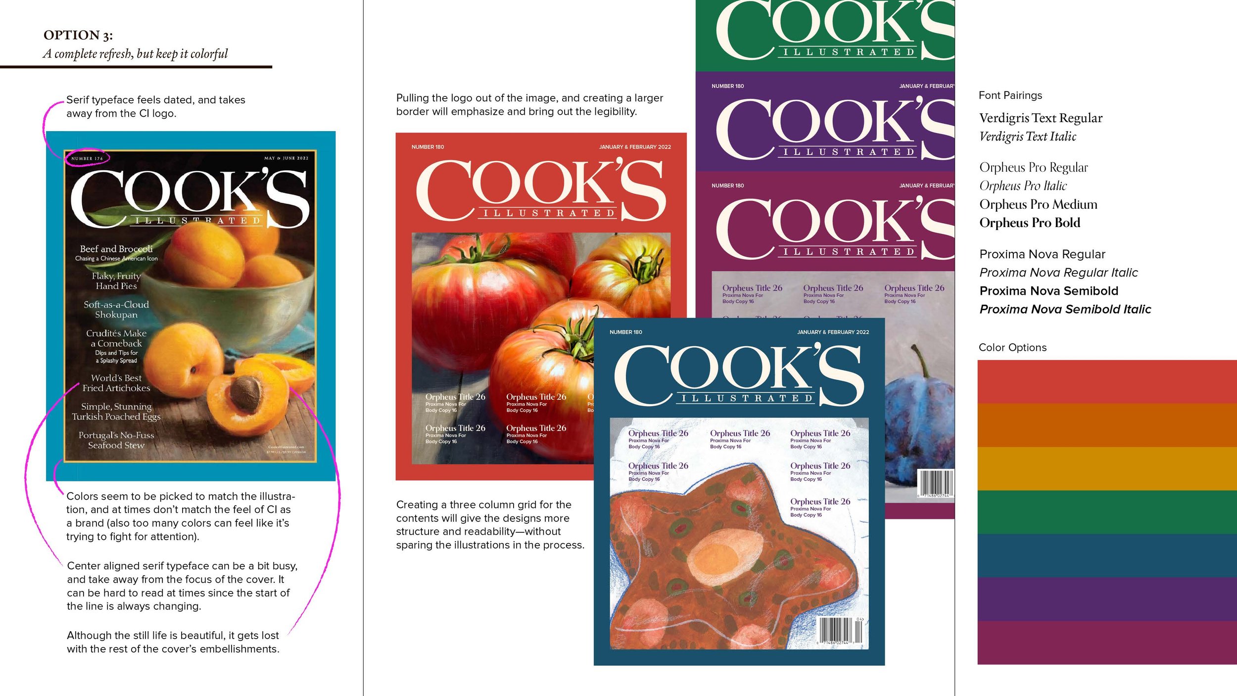
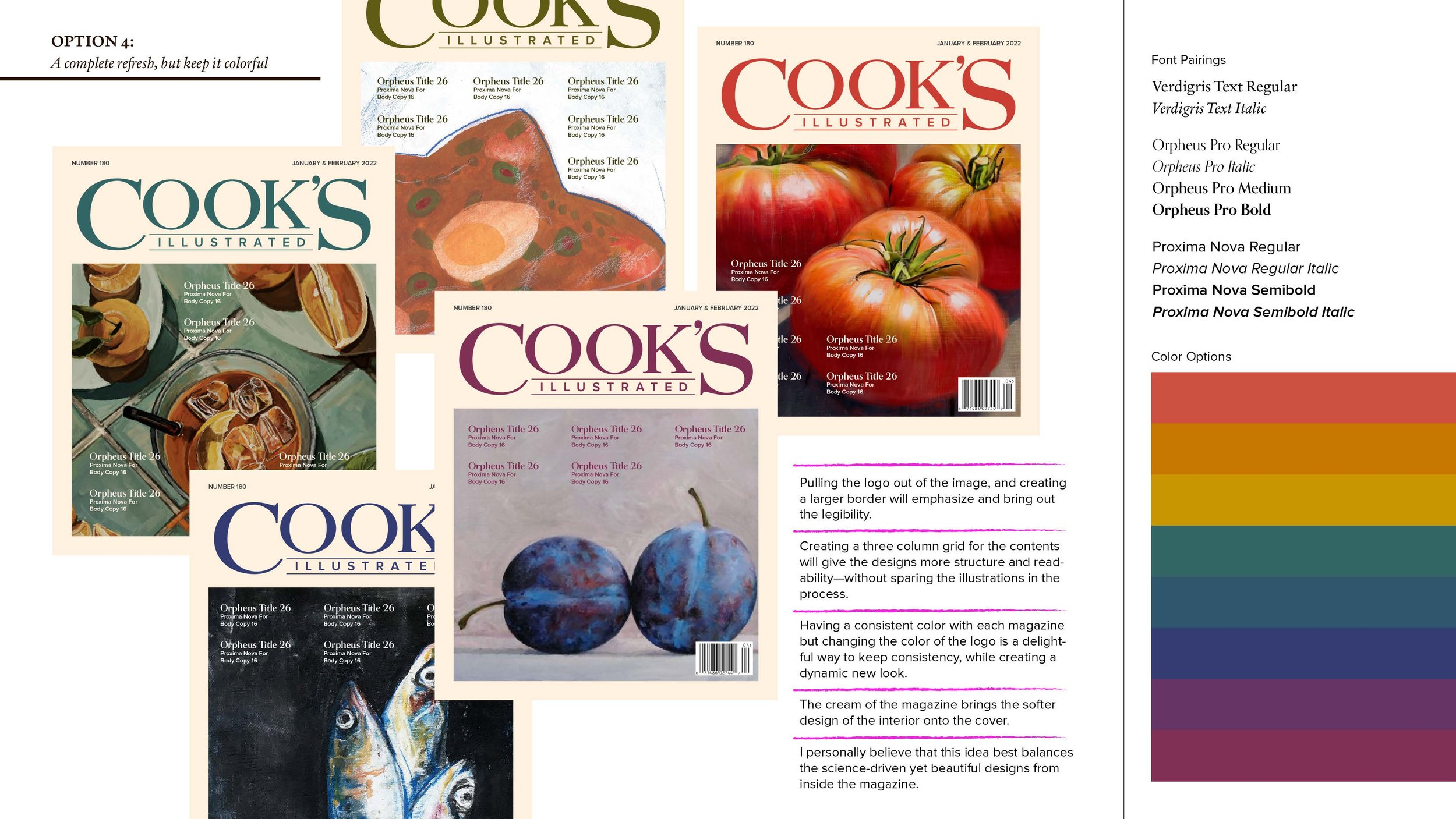
Provide multiple cover design options, ranging from minor tweaks to the current design, to exploring the original design from many years ago in a more modern and timeless way.
Collaborate with different artists to illustrate the covers, ensuring a fresh and dynamic look that keeps the magazine visually engaging and appealing to a contemporary audience.
Logo Goals:
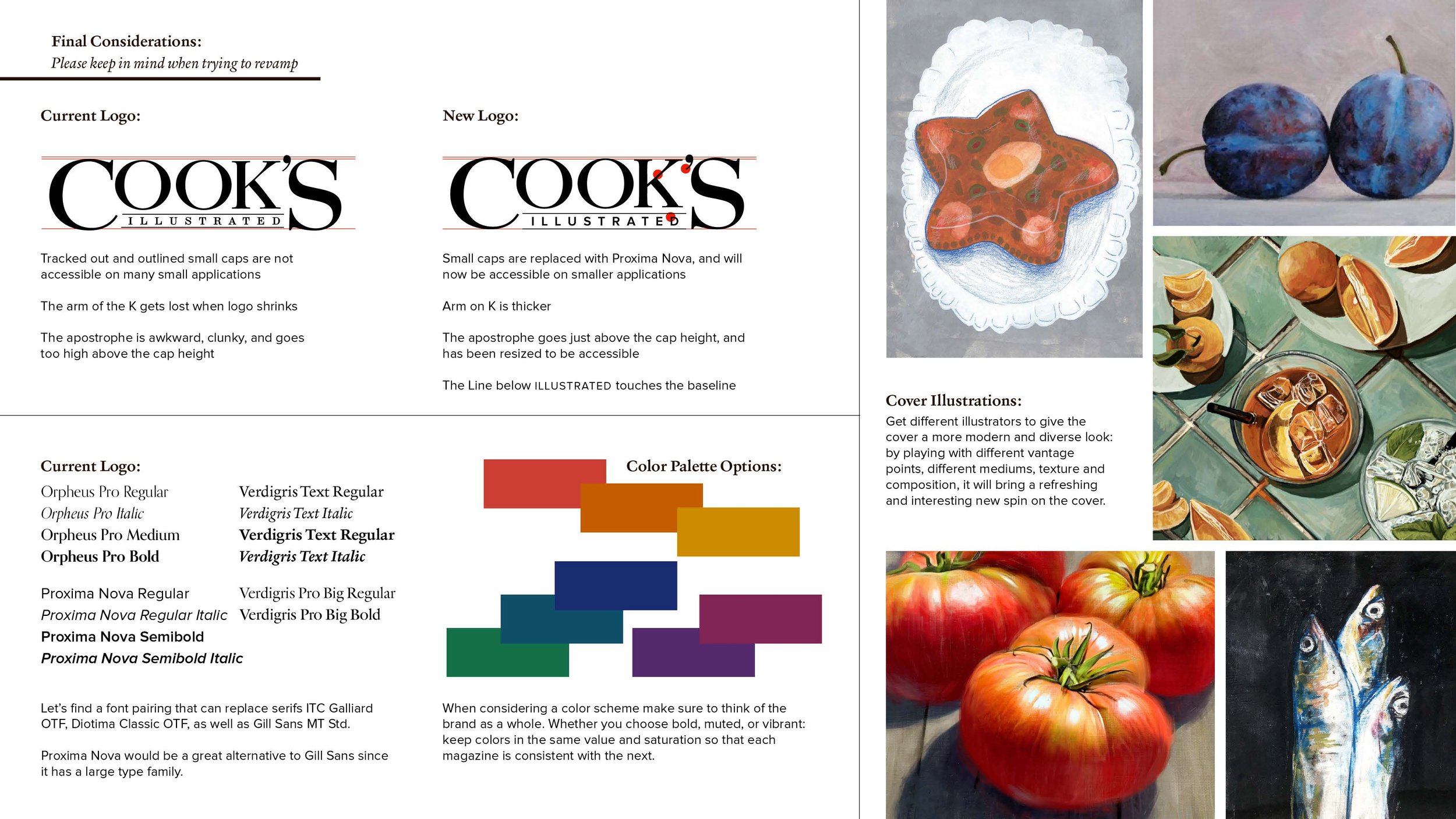
Edit the Cook’s Illustrated logotype to incorporate visual changes that enhance accessibility, especially when viewed in smaller formats.
Replace the "Illustrated" serif font with Proxima Nova to improve legibility and modernize the design while maintaining its integrity.
Thicken the arm on the letter "K" to improve visual balance and clarity.
Adjust the apostrophe for better visual accessibility, ensuring the logo remains clear and easily readable in all sizes.
DESIGNED AT AMERICA'S TEST KITCHEN ALONGSIDE THE Art Direction of John torres & Jay Layman. Associate art direction and co-design By Sam Huber